


Innovation & Tradition.
Old & New techniques and process in Art and Design.
Brief
I have been asked to research traditional processes and materials that were used before the digital era to greatly improve my knowledge on art & design.
I explored processes used to publish books and techniques that I'm interested in like 3D modelling and how it has shaped today's industry.
Throughout this project, I was asked to develop a brand identity and name for a book publishing company, along with 2 book cover concepts for the upcoming book, "The Art & Design Anthology: Tradition and Innovation in
Art & Design".
Research
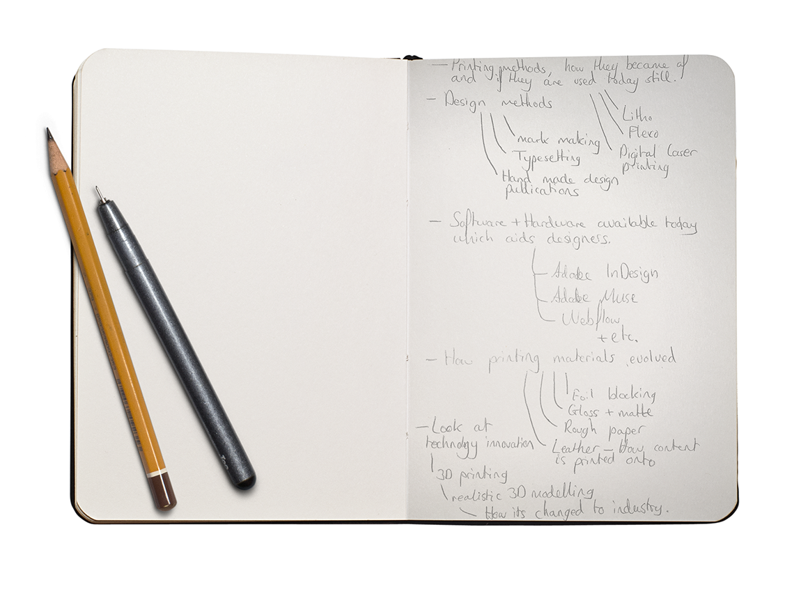
To start off my research, I made a list of things I could research giving em a starting point. I wanted to research typesetting and printing techniques more so as my brief is related to book publishing, so it made sense to research this. However, I did research parts that related to my personal background like 3D modelling software and 3D printing, giving me a much broader range of techniques that could be used when it came to designing book cover concepts.
Printing Methods:
- Litho
- Flexo
- Digital laser printing
Design Methods:
- Mark making
- Typesetting
- Hand made design publications
Software & hardware available today:
- Adobe InDesign
- Adobe Muse
- Webflow
- Squarespace
Evolution of printing materials:
- Foil blocking
- Glosee & Matte
- Rough paper
- Leather - Hot stamped on
Technology innovation:
- 3D modelling and printing
- How it has shaped the industry

Old & New research
With these notes there as a guide, I started the research of old and new design processes, materials and techniques and what helps us in our daily designer lives. I made notes down in a notepad document before I converted everything, including visuals to the below research layout. When I was researching, I made sure to look at different sources so I could better rely on the information, the first thing researched was typesetting as I loved how type was set out on pages before the digital era. This section can also be downloaded as a PDF below.
DOWNLOAD PDF
Typesetting
Before computers could even process images and create text documents, type and layout was considered an art. You needed to be very skilled to layout documents, especially when these publications required large amounts of text. So, educate yourself with the old design techniques
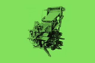
Mechanical Composition
Nick named “Linotype”, the first mechanical type casting machine was invented in 1884. It produced solid lines of text from rows of matrice. Each matrice contained
a block of metal which had an impression of a letter engraved.
This lead way to small form factor mechanical machines know as “Teletype-writers”, or typewriter
for short. I think we all know what these did.
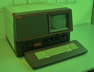
Digital Era
With technology now vastly
growing in speed, performance and intelligence, phototypesetting rapidly became obsolete. The first software to aid typesetting was introduced in the 1970s, early 1980s which changed the way designers set type for the years
to come.
These software packages allowed for easy typesetting as the processors within them could render a whole page of type and some even being able to render high-res images.
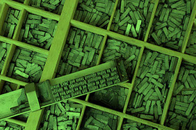
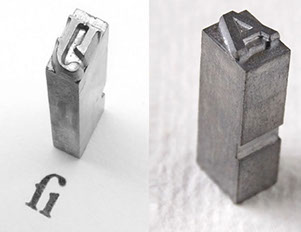
Hot Metal Composition
Invented in the mid 15th Century known as ‘movable type’. It was intruded in 1448 but accepted in 1462 making it widely used.
Each piece had a raised image of a letter, number or symbol which had to be aligned on a composing stick one by one. The pieces were then inked and printed onto the page.
I personally think its awesome how printed type meant selecting each character one by one.
Phototypesetting
First appearance was in 1960, phototypesetting is where computer type setting began. It was the early generation on computing which consisted of glass discs
(one per font) that spun in front
of a light source, which selectively exposed characters onto light-sensitive paper.
The first machine of this concept had no display, just a keyboard. Text was in-putted and then verified by you having to type the same line again to which a bell rang if it was correct.
02. Typesetting
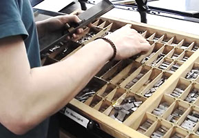
Hot Metal Composition
This was a required skill when setting out publications back in the day. you had to understand layout far beyond margins, guides, columns etc. found in today’s software packages. With hot metal composition, you were required to lay out each line BY HAND, resulting in hours of work and constant checking to ensure a single page was laid out as the client requested.
1 - Calculations
A client gave you the text, to which you spent a few hours calculating how many letters, how many spaces and how many lines it would take for that text to fit on a single page, in a specific area. This was quite challenging as it required a lot of checking to make sure things were near perfect.
With this calculated, you set up the composing stick to the specific size required.

2 - Lettering
After the composing stick has been set, the designer now has the challenge of selecting each letter one by one from a selected font, at a calculated size and is added to the composing stick. A paragraph is added at a time for easier layout.
Each letter had to placed on the stick in reverse so when ink is applied and the type is printed, the type is readable.
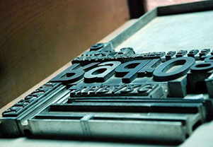
4 - Printing
The plate is placed onto a roller press, each letter is then coated with ink ready for the roller to roll over. A piece of paper the intended size is attached to the roller, then rolled over the plates which are held in place and the type is successfully printed onto the paper.
The roller is on a track so with each piece of paper, the layout is the same.
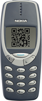
Scan to watch a video on Hot Metal Composition.
3 - Publication layout
The paragraphs that have been set out already on the sticks are then placed on to a metal table to which a metal frame is placed around it in the size of the publication document(A4, A3 etc.).
Spacers are then added to fill the empty space and in between paragraphs to hold everything in the position required. The frame and pieces are held in place with the block spaces which widen to tightly grip everything together.
03. Hot Metal Composition
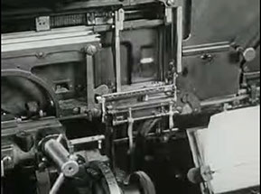
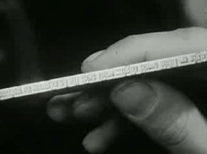
Mechanical Composition - Book Printing
During my research on traditional typesetting, I stumbled on a really interesting video which showed how a mechanical composition machine is used to typeset a book ready for printing. This was the method of choice in 1947 as it was faster than hot metal composition, much more effective and very cost efficient, and also because phototypesetting wasn’t introduced yet.
1 - The Story
An author writes a story and then sends it to a printing shop for it to be made into a book. First, the whole story is written again exactly how the author wrote it, word for word, by a typesetter on a mechanical composition machine to set the type.
Every key that is pressed, a mould for that specific letter is slid into a box the width of a piece a paper, making a line.
2 - Metal Moulds
Molten metal is pored into each letter mould of that line which is then cooled, becoming hard and then pushed onto a plate below to previous lines. A composer takes the finished lines and places them onto a huge table, separating the lines for each page.
3 - Page setting
The finished pages are then passed to the composer where he lays out 4 pages on a plate, then passed to a press to make the soft metal letters into copper so they aren’t worn out during printing.
The pages are then passed to the ‘ready man’ where he lays the pages on the press bed, which fits 64 pages with 2 sides for both sides of the pages.
4 - Printing
The press beds must be filled full of plates before the button is pressed, sending large sheets of paper along the press to print the pages. The paper is then sent to a folding machine which folds the paper down to the page size.
The pages are used again for more print runs at a later date if the author requires so.

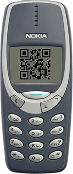
Scan to watch a
video on the Book Printing Process
04. Mechanical Composition - Book Printing
Mark Making
There are many ways that a designer can use to make marks, whether that be initial rough marks for idea generation, or methods used to provide drawings/illustrations on old fashioned brochures, books and magazines.
Paints
Paints are mainly used by artists but were also used a lot by designers to create really unique publications as well as logos. Designers used paints as a idea generation tool too to experiment with a different style form and see how designs acted with a different medium.
Today, most paint designs are done digitally using Photoshop brushes, however, you don’t get the authenticity as real paints.

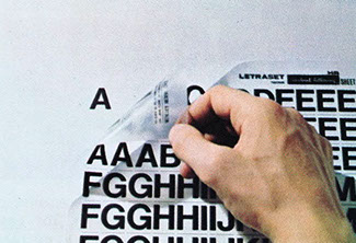
Letraset
A British company that specialises in dry-transfer sheets used for type and colour transfer to paper. These paper sheets consisted of different font choices, type sizes and even different colours.
They became a thing in the early 1970s as a more traditional method to the digital Era.
Specific logos were also made into Letraset sheets for designers to use when designing publications for other companies.
Pencil Drawings
We all know what can be done with a range of pencils or even just a single pencil shade, but designers used the good old pencil to produce rough marks and sketches that are later developed on using Letraset, paints, markers or other methods to produce
an illustration to suit the clients needs. Some publications were purely made from pencil!
Today, designers use pencils (or pens) as a creative tool for idea generation, if you didn’t already know however!
05. Mark Making
Letraset
The British company Letraset produced a wide variety of creative tools which aid designers to produce handmade publications and designs that still look surprisingly modern by today’s standards. Letraset is still around today but not how it was decades ago.
1 - Typography
Designers used Letraset sheets for titles and sub titles when making a handmade publication as it was so much easier than using phototypesetting and produced much better results.
To apply the letter to paper, a dry-transfer sheet with all the lettering is placed and a pen is used to scribble over the letter thus applying to the paper beneath.
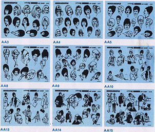
2 - Clip-Art sheets
Whether you’re producing a Health & Safety poster or a publication book about a city, these clip-art sheets became a very handy tool for designers. There were vast varieties of art to choose from.
Today, we jump online and have huge libraries of free-to-use vectors, the same concept as Letraset clip-art sheets.
3 - Colour sets
These were used to apply colour to your design. You placed the sheet over the top of the artwork, making sure it completely covers the area wanting colour, then draw on the sheet around the given area using
a scalpel to cut it out.
This gave way to unique handmade publications which became apparent in rare history books of places or other books that would
be used for decades.
4 - Protective coating
Toxic aerosol products were used to coat the Letraset markings in order to keep them intact for years to come. The products applied a thin polymer coating of the top of the dry-transfer which allowed it to be resistant to wear.
Many books from the 1970s era are in still really good condition today and the design even lives up to today’s standards!
See more about Letraset dry-transfer here:
http://creativepro.com/scanning-around-gene-when-letraset-was-king/
06. Letraset dry transfer sheets
Pencil Sketches & Modern Letraset uses
If the first thing you do when you get a design brief is sketch ideas that pop into your head, make spider diagrams or a list of key points, and research current designs related to the brief then you may have come across the good old fashioned pencil and paper! Nearly every designer today uses pencil as an idea generation tool but a few decades ago before computers were the design tool of choice, many designers were artists and able to produce designs like we see today.
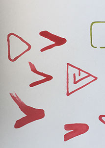
1 - Sketches
The natural form of idea generation that every designer should and must know in order to come up with a design path. Branding is a big factor in everything you do so when designing a logo, a sketch of the logo idea and expand on that to see how it would work with different mediums.
2 - Letraset Markings
Today, Letraset offer a huge range of premium quality markers which are a great way to develop initial ideas using colour. These markers are also used by many traditional designs to achieve sign writing in
a different way than using oil paints traditionally used.
Letraset also offer the original
dry-transfer sheets so if you want to use those in your design today, you can.
3 - Pen Marks
The one up from pencil sketches are pen, just without the control you get over a pencil. However, with a pen you can flow more easily as a pen is used everyday for note taking. Pens are more accessible and don’t require thought, you literally put the pen on the paper and let your mind flow.
4 - Paints
Most traditional designers and artists still use paints as a way to develop their initial ideas either to see how the design works with different materials and inks.
Paints offer a natural feel if done naturally of course, designers can opt for the modern ‘fast’ method by using free brush sets in photoshop but you miss the authenticity feeling if the design is printed.
07. Sketches and Letraset today

Example of Letraset use
My co-worker, Mark lent me a very old book detailing the history of Sheffield titled “Sheffield: emerging city”. I found this extremely interesting considering the book was published in 1969. Most of the type would have been set using the mechanical compositing or phototypesetting I should imagine, with the most interesting parts being the the colouring, done by what I can only assume, Letraset. The book was intended to explain to citizens that the city is changing from its industrial past and highlighting future plans (today).
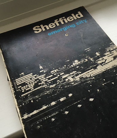
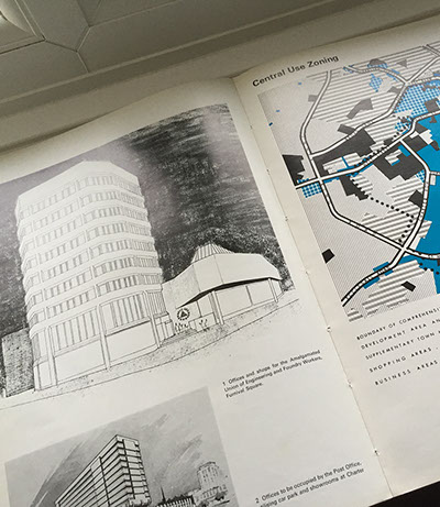
08. Sheffield: Emerging City 1969
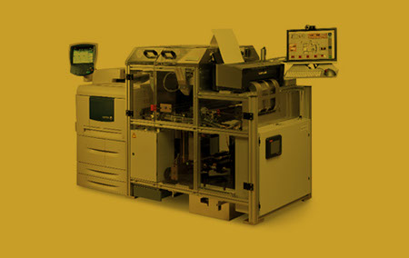
Printing Processes
A lot has changed in the last century when it comes to printing, it is a lot easier today to print huge page publications than in the past. Nearly all of us own a digital printer for home use (with ink costing an arm and a leg) but before the first home printer, printing was an industry only thing.
Digital Printing
There are 2 dominant technologies, Ink-jet and Xerography. Ink-jet prints the image using small droplets of ink which are propelled by the ink heads onto a range of substrates like paper and canvas. This technology is used in home printers.
Xerography like laser printers, involves a charged metal cylinder (drum) which attracts the toner ink before transferring it to the substrate.
Examples: Mainly promotional material, letters, books, billboards, labels, Black & White images.
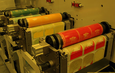
Flexography
Mainly used for packaging printing. The process involves rubber printing plates which is flexible, hence the process name. The flexing makes the process ideal for any kind of packaging, especially cans as the ink can be transferred directly onto the material via the roller.
This is quite a traditional process thus more packaging printing has started to shift from flexo to digital printing.
Examples: Shopping bags, cardboard boxes, newspapers, books.
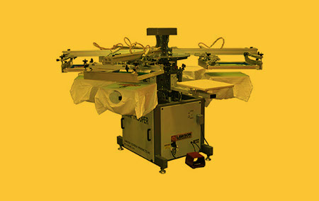
Screen Printing
The process involves a woven fabric which is placed on a screen. Parts of this mesh are contain with a non-permeable material to block the ink from being passed through, the open spaces allow the ink to be pushed through the mesh onto the substrate.
Substrate materials that can be used is very wide and the surface doesn’t need to be flat.
Examples: Wallpapers, small runs of posters, display boards, fabrics, electronic control panels.
09. Printing Processes
Materials
There new materials introduced all the time as part of innovative design but traditional materials are often used today to give a design that ‘original’ feel, especially if the company specialises in refurbishment or repairs, traditional material would give more depth to a logo.
Gloss/Matte Finishes
Gloss finishes can either be done like foil blocking, showing only the parts you want in gloss (also known as SpotUV, which is similar), or the whole page is gloss like on magazine covers and sometimes , pages inside.
The method for full page gloss is by laminating the page with a resin to give the page the gloss effect. For the certain parts on the page works in a similar way or foil blocking, but instead of foil it is a thin sheet of resin that’s applied.
Fabric
Printing onto fabric is used on almost all everyday items like
T-Shirts, duvet covers, towels etc.
to give that product a more of a personal feel. You can even print onto T-Shirts yourself using transfer paper.
Transfer paper is used the same as normal A4 paper, you print your design in reverse using a normal printer then apply the paper onto the t-Shirt and iron over it.
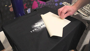
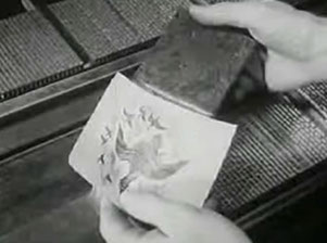
Foil blocking
This is where metallic foil in either gold, silver or other colours is used to create a ‘high class’ feel to the design publication. A foil sheet passes the paper, stamping the foil onto the paper in the design requested, resulting in the foil being pressed onto the paper.
Foil blocking works extremely well with matte print as it truly lifts the design off the page and gives a really high quality feel.
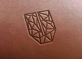
Leather Embossing
The way this is achieved is by pressing the design onto the leather using a heated press, which burns the design on giving a slightly darker look as well as an
embossed feel.
This is quite an old technique and is used on a lot of book covers, reflecting tradition and also used on notepads for company’s to give a ‘high class’ feel.
10. Materials
Software
Almost all designers today working on print material will use Adobe software, with some designers using other software and even occassionally using traditional processes to achieve the classic feeling. Over the last few decades, software has really developed, from Photoshop being used purely to edit images, to it being used for web/app concept designs.
Digital Printing
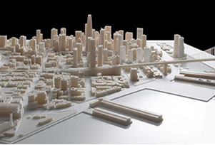
3D modelling softare thats realistic has been around since the early 1990s which is evident from the first Toy Story film, but the software was used a few years before for films like Terminator and Jurassic Park. 3D modelling today is so advanced, you won’t even be able to tell the difference between CGI and realistic. Software like Sketchup is basic modelling software for beginners but plugins offer lighting engines, animation etc.
Examples: 3D product showcase, movies, apps, games etc.
Screen Printing
Adobe Muse is quite a new software package which allows designers to create stunning one-page and normal websites. Muse also allows designers to focus on the layout and design structure of the website as you would do when concepting a site, then export it as HTML there and then to publish or show to the client. Muse also offers scroll motion/opacity affects, as well as Edge Animate integration for advacned animations
Examples: Websites, portfolio sites, one-page sites.
InDesign
In case you didn’t know, InDesign is a publication/layout software package used to create print documents. However, it can be used for web publications and web design concepts as you have more control over type, image placement etc.
than Photoshop.
The PDF for this research was created using InDesign, then exported as a PDF.
Examples: Magazines, email newsletters, web concepts, web PDF books etc.
11. Software used today
Example of Letraset use
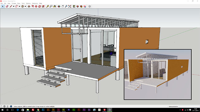
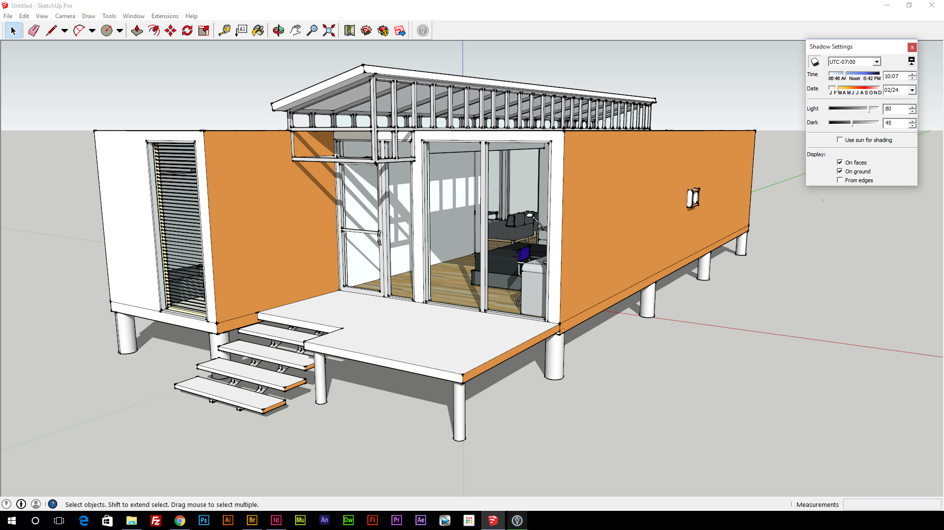
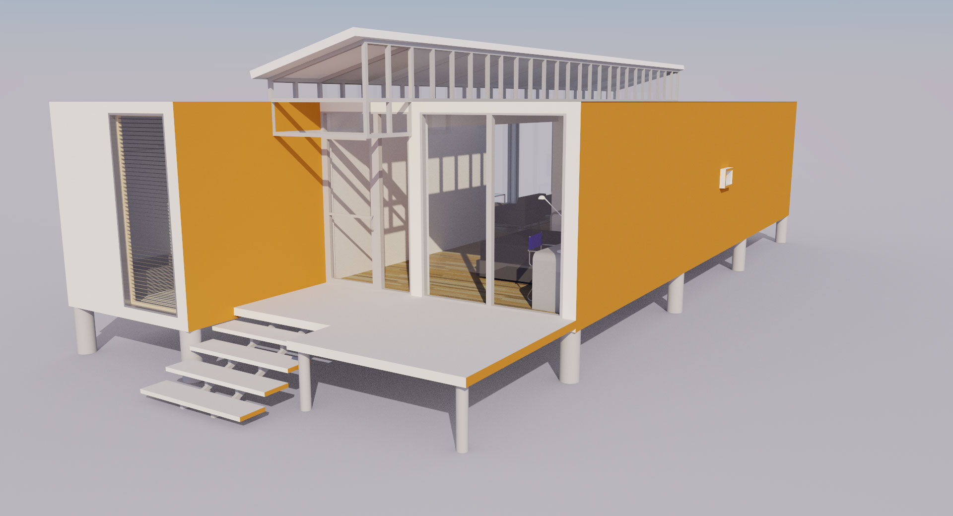
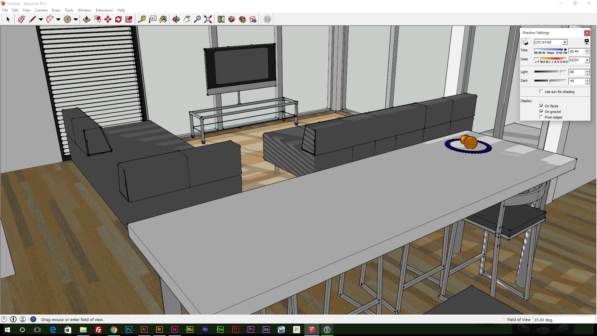
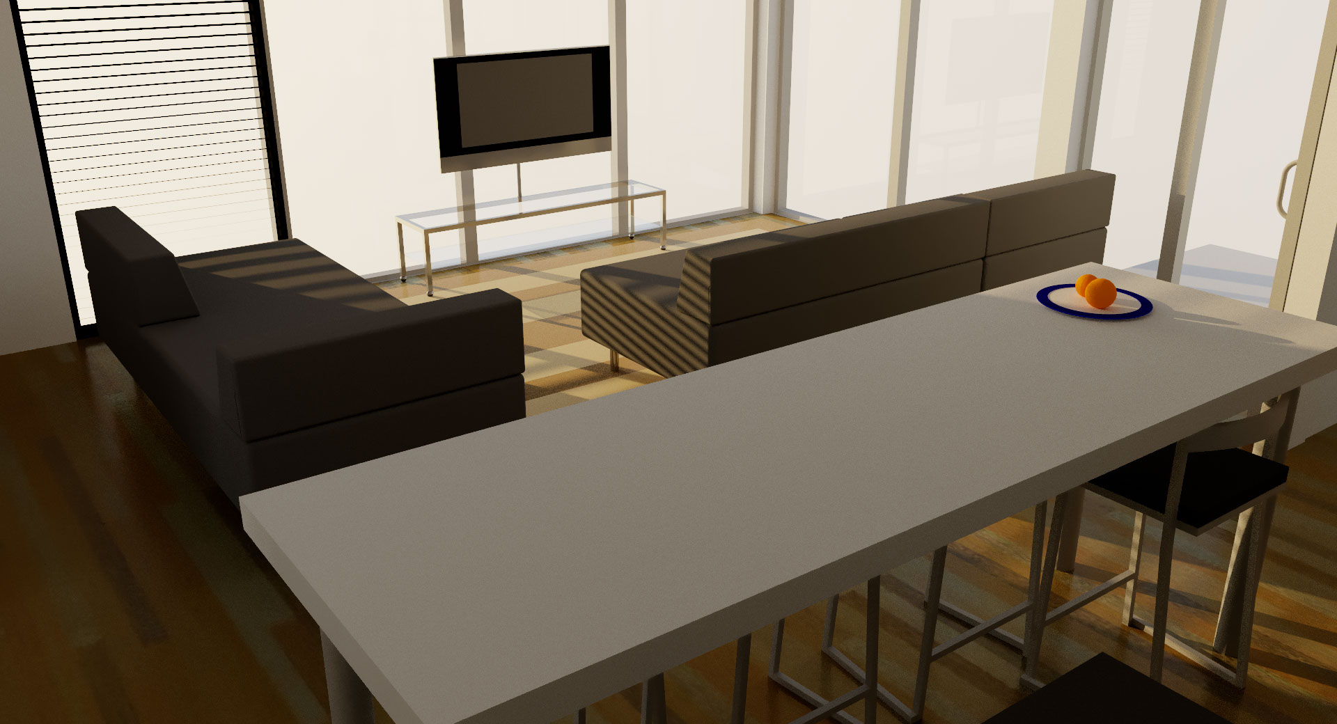
There are a lot of designers like myself out there that don’t want nor have the time to learn complex 3D modelling software like C4D or Blender. Although these software packages are extremely good at what they do, Sketchup offers simple controlls and a boat load of plugins to enhance the modelling process and exports. Viuslizer is a free tool that uses the in built lighting engine and adds realistic shadows and shading on top giving incredible results for both outdoor and indoor scenes.
The cool thing about Visualizer is its a 1 click button to render an image, with toggles for noise reduction, enhanced materials and surpress particles. Enhanced materials uses the in built material system within sketchup to determine what lighting to use, for example, glass will have reflections.
View the next pages for full render previews of this model using the software.
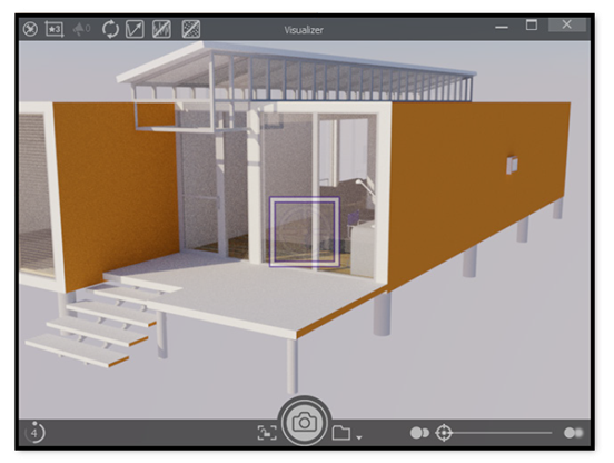
12. Sketchup & Visualizer 3D software
<
>
13. Visualizer outputs
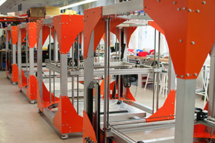
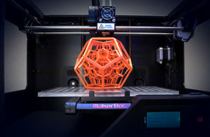
3D Printing
A lot has changed in design over the decades, and a new innovative technique is 3D printing. Designers can use this to print out lettering, models relating the client, products etc. that tie into the brand research and then use these models to create mini scenes. Most creative way of doing this is to produce high quality models that are small then place them in real world environment stages to give an awesome perspective, like mini characters living among us!
1 - 1980
The first 3D printing patent was filed, know as rapid prototyping (RP) back then was a machine capable of, well, printing prototype products. 7 years later, the first 3D printer (SLA-1) became commercially available.
2 - 2007
The first 3D printer under $10,000 was introduced and of course, consumers went crazy for this and saw many others getting into 3D printing. This was the year that 3D printing aimed to be more available due to Dr Bowyer and his RepRep open source self replicating 3D printing technology.
A dream was set to get a printer under $5,000 which seemed impossible but now you get one for £300 if you dig deep
3 - 2009
RepRep commercial printers became available, 5 years after development started in 2004. This allows printers to use technology that is accessible to everyone, just like you see in standard printers.
4 - 2013
This was the year of growth. 3D printers became a lot cheaper and accessible, so almost everyone can own one. In a few years, I reckon about half the households world wide would have a 3D printer as they do have a normal printer.
2013 was also the year of edible printing ‘ink’ so you could literally download a food schematic and print it. Yes, with are in that world now.

14. 3D Printing
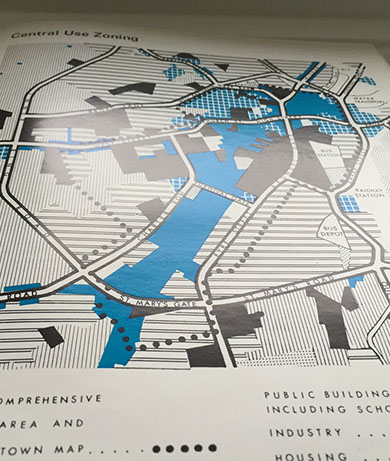
Book Cover & Existing Branding Research/Initial Ideas
The initial research above helped me to determine the best techniques to use when designing the final book cover for "Old & New", but I hadn't done any research on existing book covers and publishing companies branding. There are 2 really big and traditional publishing companies that stood out the most to me, Penguin and Puffin. When looking at these brand, I looked at their books from the first years of operation. This aided me to see how I could design my book cover to have that traditional nostalgia.
Puffin Books
Founded in 1940 by Allen Lane, Puffin Books became Penguin Books' sub organisation for every children's book published, splitting the publishing into 2 different categories based on the authors chosen audience. Both companies share the same brand identity with the difference being colour and animal in the logo and more child friendly front covers.
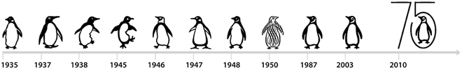
Penguin Books
First founded in 1935 by Allen Lane in London and set out to publish paperback books for all ages, mainly children stories until a few years later, making publishing a lot easier and accessible to many authors. Going on my previous research, the rise of mechanical composition also made the foundation of penhuin (and other publishers) a lot easier and worth while.
Logo
Penguin's logo hasn't changed much over the years, with few drastic changes to the formation in 1950 which changed the company's identity, resulting in a refined original version being used in 1987 to bring back the tradition. Most people today probably won't recognise the 1950 logo as Penguin's. From 1987, the logo hasn't changed much other than slight refinements.
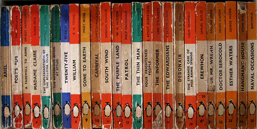
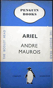
Original series
The first book to be printed, and almost every book published for the years after that stuck with the same cover style, displaying no more than the title, author and publisher. The cover was a solid colour matching the genre, with a white band across the centre with the book title and author, along with the company logo, name and their secondary company name, The Bodley Head.
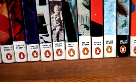
Spine
With the traditional penguin books, the spine kept a similar style to the cover with the white strip and colour, the logo being displayed at the bottom along with a number indicating how many books they have published.

My brand research
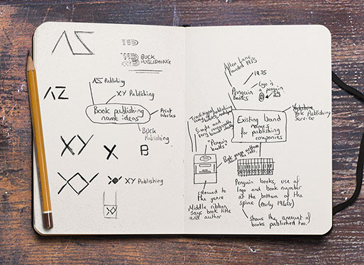
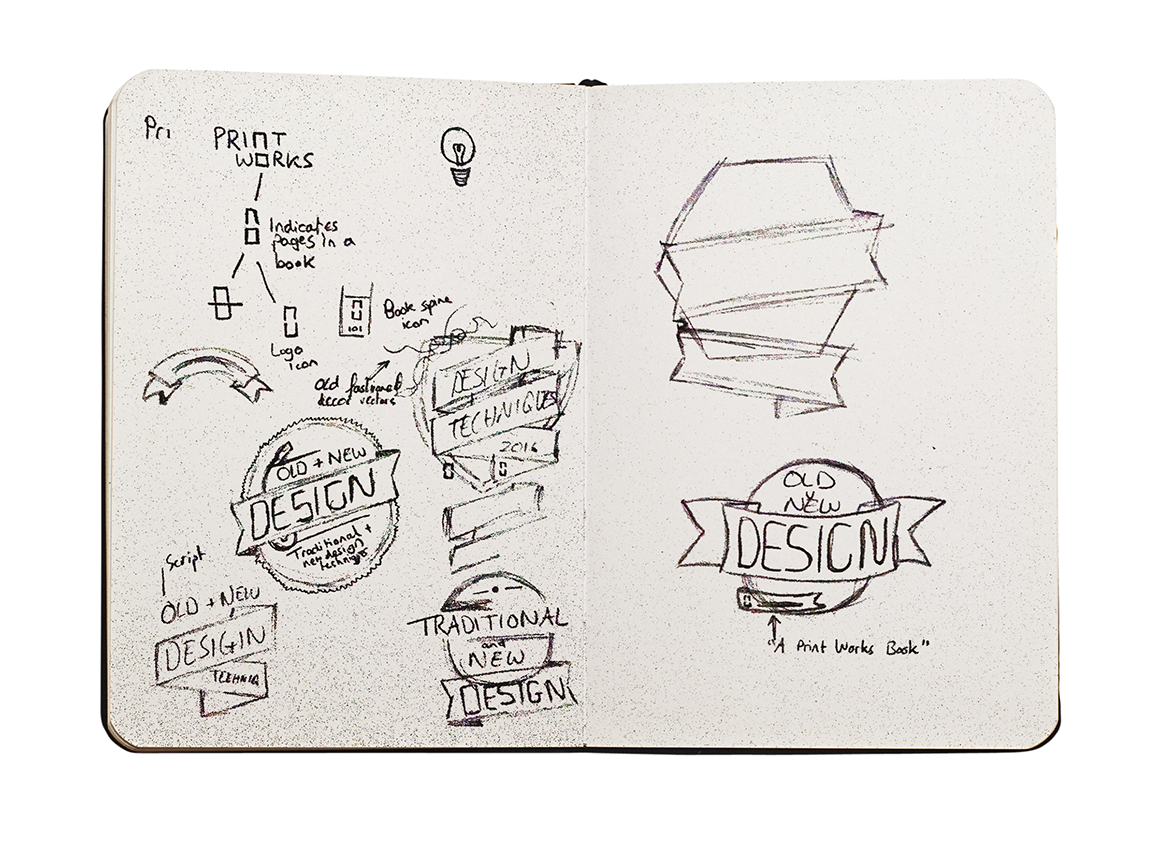
I wanted a brand name that was obvious to the consumers what the brand was, and a logo that can be seen as traditional and modern at the same time so I noted some ideas, with Buck Publishing being the one that stood out the most having a much broader brand identity in mind already. Second on my list was PrintWorks but the name suggested a company entirely driven to publishing printed material rather than books.
Branding History
Branding has been around for a long time and was first used to show ownership of cattle, and for indeitifcation purposes in trade rather than to attract and sell the product. In other words, a can of beans would just have the manufacturer's name and the food name. In WW1, branding became a bigger deal so food items could be recognised more easily upon the many other manufacturer's during food sorting process.
Today, branding is used to let people know who made a product or service to avoid confusion between to vastly growing industry.

Brand name & design thought process
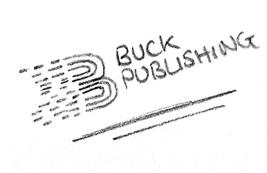
I thought of the obvious factor, books, and what the consumer wants, cheaper high quality publishing. The name “BUCK Publishing” comes from the American currency term, buck, indicating the company is a book publishers that is affordable.
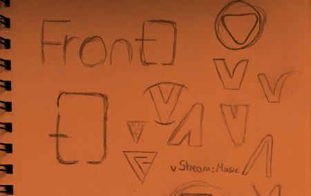
The idea of this was to create a logo that represented both the company, books and writing. So I quickly marked down an idea of lines and the letter ‘B’ for BUCK Publishing. The whole aspect of the idea was to have the lines mean text like you would see on word processing software to align the paragraphs. The way the logo sits with the lines and curves allows me to design print material and web material using parts of the logo, brand mark, and icon in a way that’s subtle yet if looked at closer you would be able to notice where that element has come from.
My original thoughts were to have a full sized logo and a mark to be used. However, I realised that it would be ideal for multiple versions for use on smaller situations for example, favicon, footers etc.
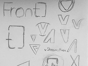
Initial logo concepts

Full logo
Small Logo
Icon
Mark/Stamp
Coloured full logo
Logo concept development
Full logo
Horizontal logo small
Horizontal logo large
Logo Problem
Straight away there is a problem with this logo brand set, the hole aspect of it. Its too business like, more corporate rather than publishing/book like. So I began developing the concept further as I love the lines and the meaning behind it, I replaced the font and changed the colours to a more neutral appearance giving a more natural look. Finally, I changed the logo itself to better represent a book publishing firm
Logo further development
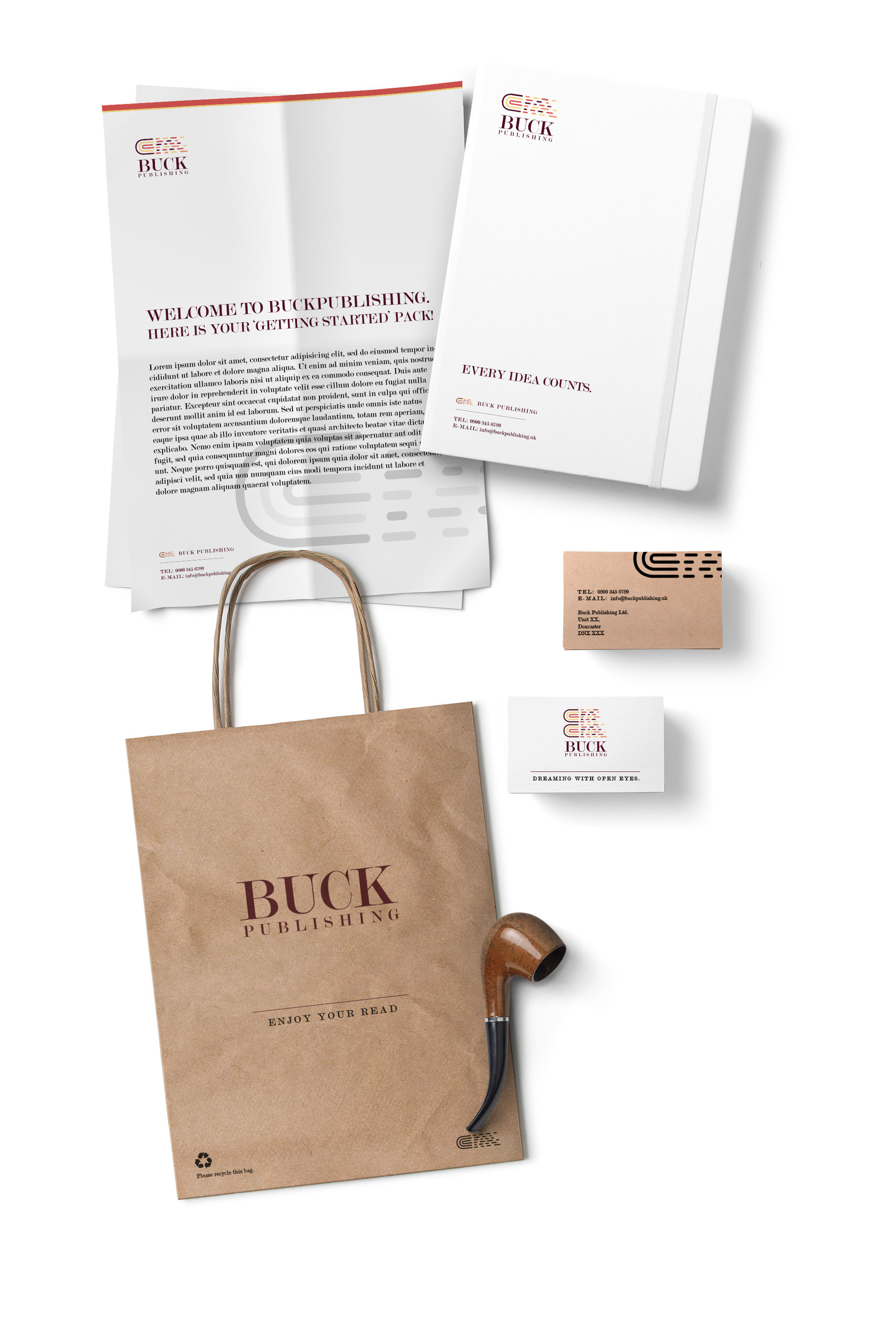
Final branding
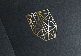
Old & New Book cover concepts
As part of my coursework brief, I was asked to produced 2 book cover concepts for the upcoming book, "The Art & Design Anthology: Tradition and Innovation in Art & Design". I researched on Pinterest, see here, mainly as well as good old Google images to for book covers but I wanted something that felt like the Penguin books, with a modern yet old badge style design. I found a lot of single colour, geometric badges that give this feelings.
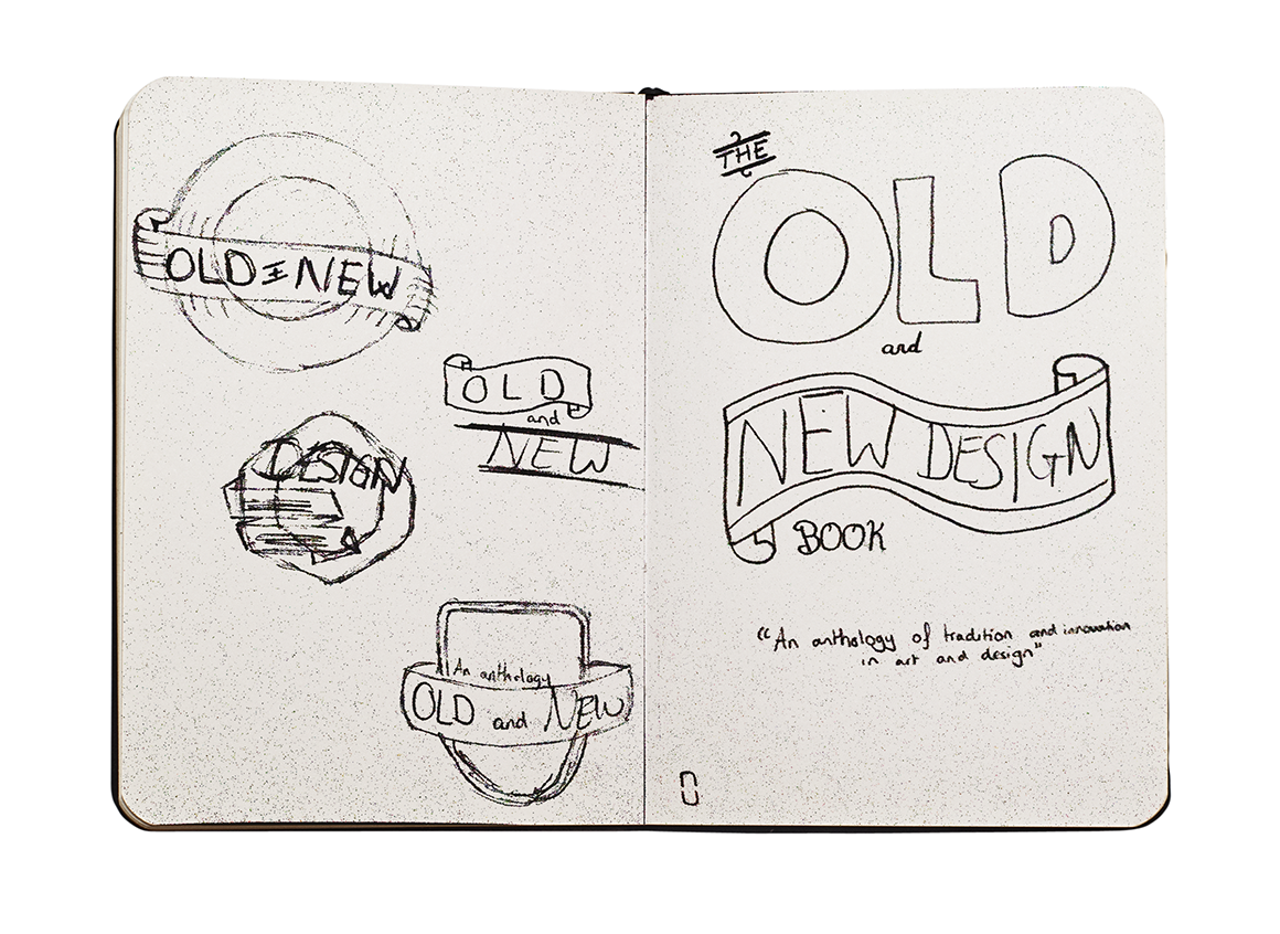
After this short brief research, I quickly came onto an idea of the theme I want so jumped into my sketchbook to come up with some designs.
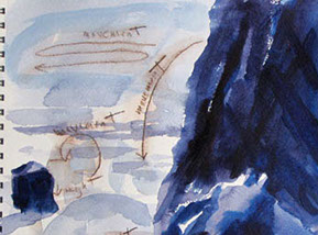
As I was sketching cover designs, I had the idea of showing old and new design technologies on a floating island with a striking ribbon going across stating the book title. I really love this design but feel like it may be a bit too complex for what is required.
I jumped on Illustrator a started to outline this badge.
The middle left sketch I quite like as it straight up tells you its a book about design but I feel it could do with a lot of work if were to use in my final cover design.
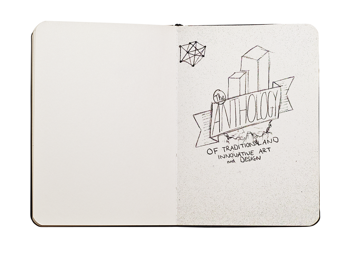
Cover Concept 1
As I had scanned the sketch in already, I used this as a guide to outline the badge using the pen tool within Illustrator. During the process, I felt the need to keep it simple so I didn't include the design technology at the top of the badge. This to me made the badge look like a badge like my original idea was rather than a floating island.
Cover Concept 2
Doing the same method as concept 1, I decided to make a bright a vibrant badge for the cover just to experiment more with colours. However, I fell this doesn't really match the books name, but instead represents a school more.


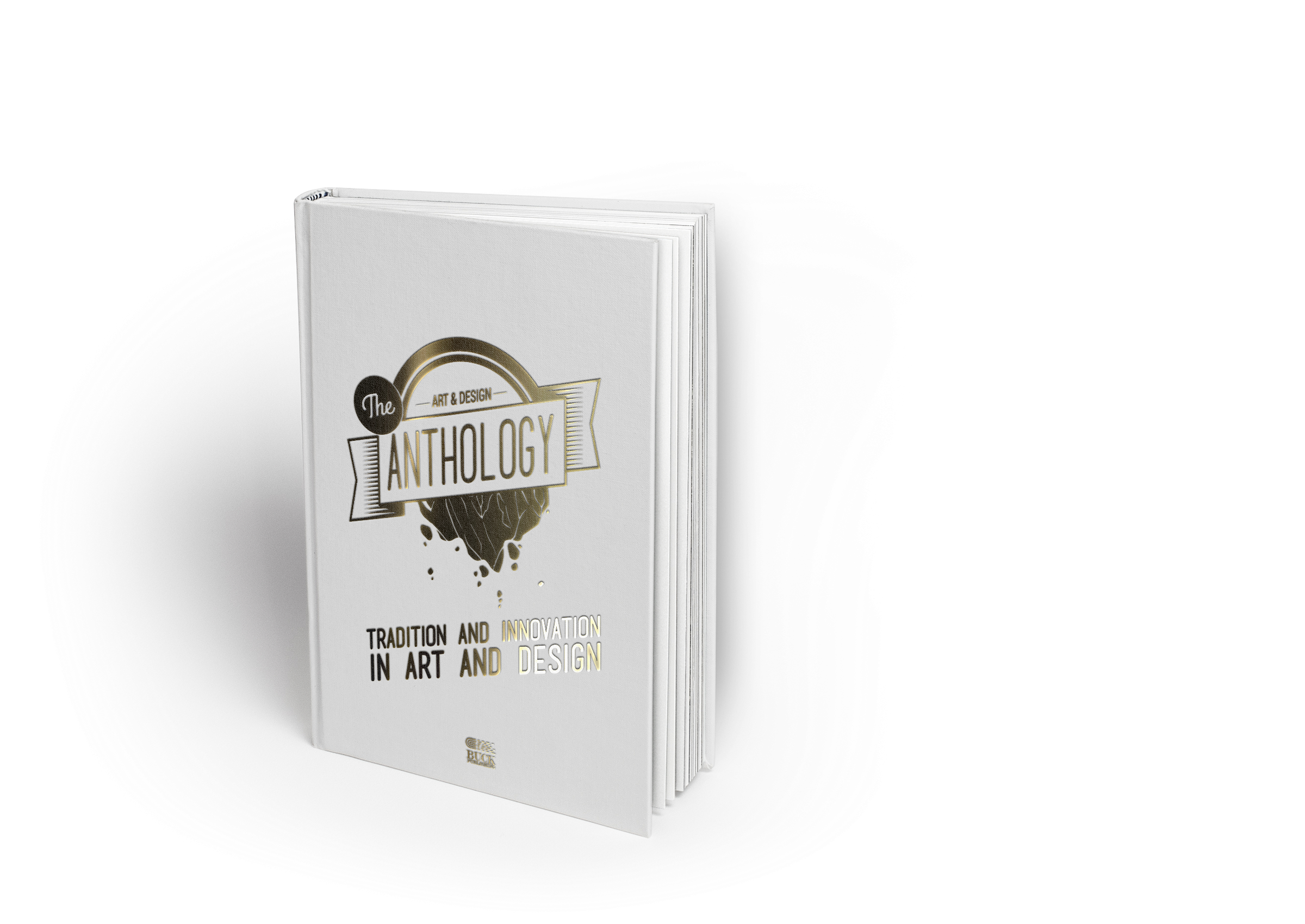
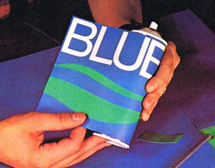
Final Cover concept
I really like the look of concept 1, but I feel like I can develop it to create a book cover that has the nostalgic feeling of the original penguin book covers. I kept the design simple and added a strip behind the badge with sub text at the bottom to better inform people. I also felt like a colour should be used to bring the design out more making it sit better on the book.
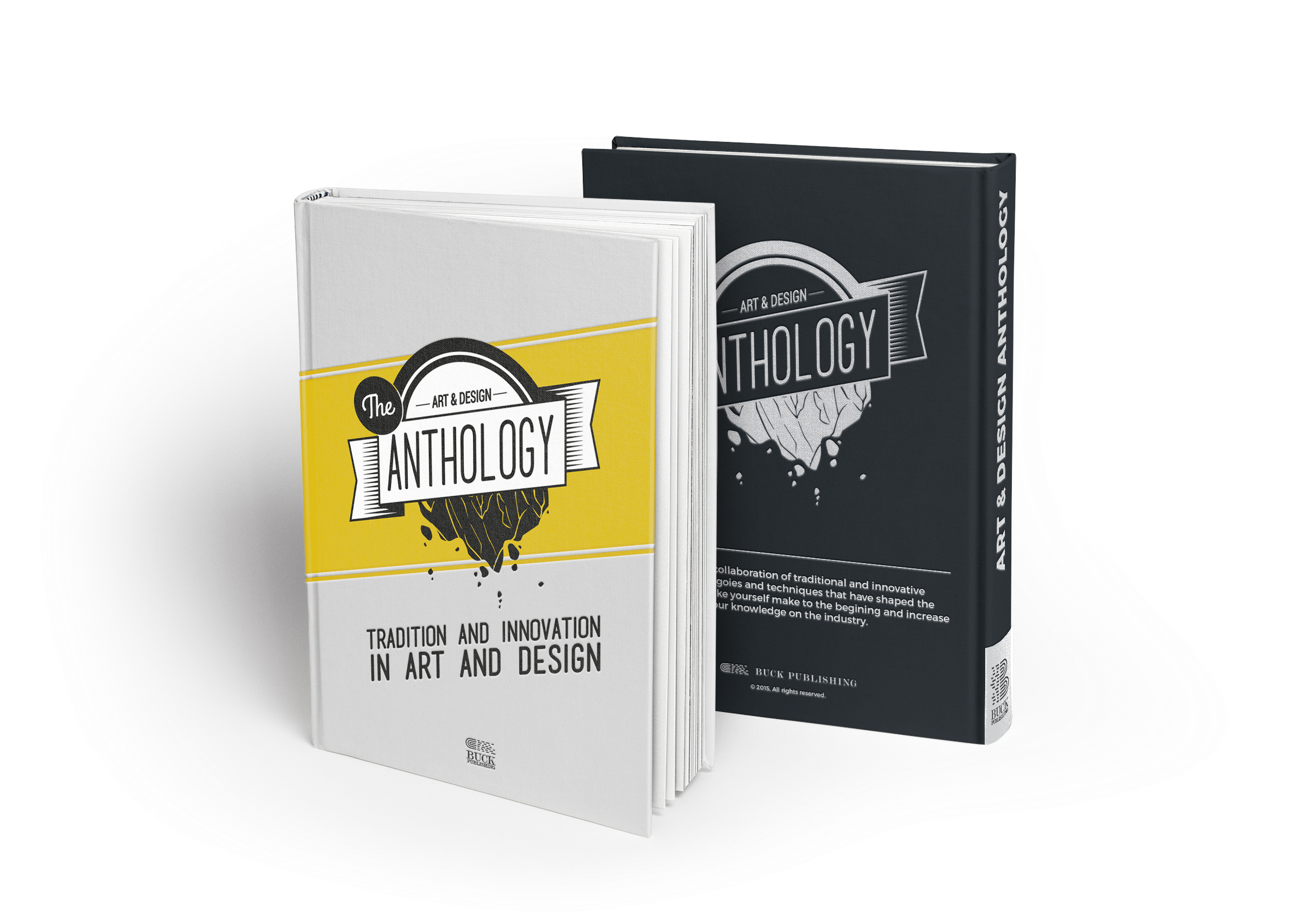
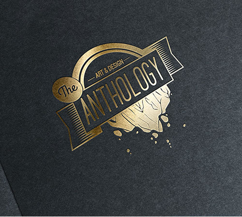
Gold Foild blocking
If I were to produce a prototype print out, I would try it gold foil blocked on black paperback book as I find this to be a really high quality finish. However, as purpose of this project I had to concept it instead due to time limitations.
Thank you for viewing!
Bookmark this page if you're a VOCA VOCA student doing this project, you can use this for help/inspiration. If you prefer to view the PDFs, please download them below (reference only).
Size: 8.98MB [Added 16/01/2016]
Size: 4.27MB [Added 04/01/2016]
ENTERTAINMENT
DESIGN
THEATRE
FOLIO
CONTACT ME
ICONS SOURCED FROM FLATICON,
© CORRESPONDING AUTHORS.
VAULTNETWORK IS A PART OF VAULT
ALL RIGHTS RESERVED.