Dr Marten's DPS.
A double paged spread for a magazine featuring Dr Marten's.
Brief
As a designer, developing my typography skills and ability to layout double paged spreads and other magazine layouts is key. I was asked as part of VOCA VOCA apprenticeships to research, concept and produce a final double paged spread for a magazine.
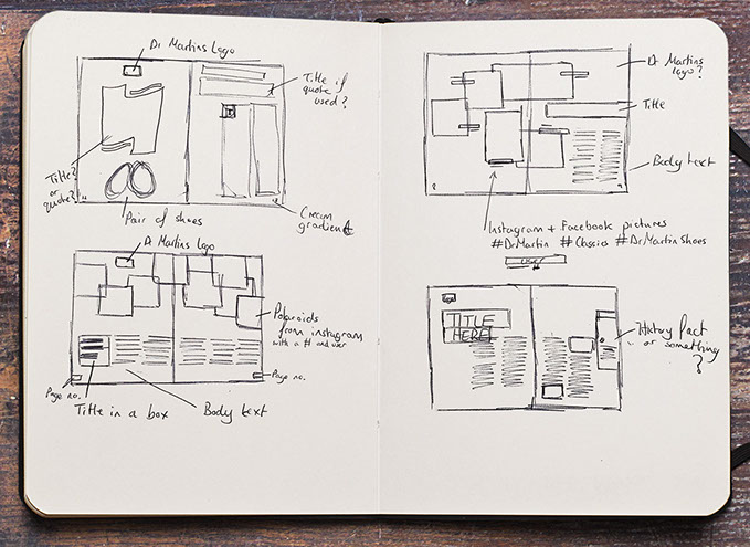
Throughout this project, I did a bit of layout research both on Pinterest and experimenting with sketches in my sketchbook.


Double page spread concepts
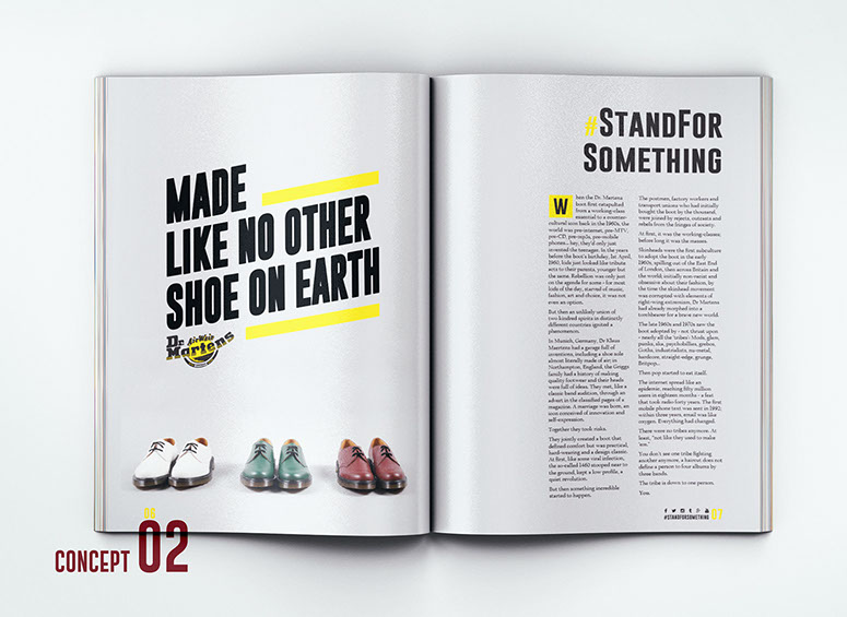
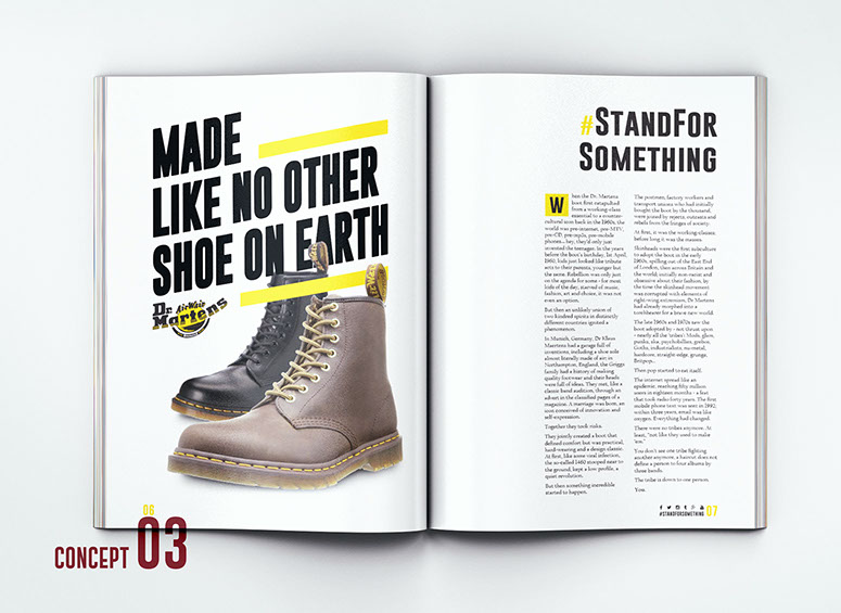
After doing my initial sketches, I opened up an InDesign Document and setup all my margins, columns and baseline grid ready to experiment with the ideas sketched. Some designs worked and some designs could be developed to give a unique DPS. Some of the elements were made in Illustrator ( left page on concept 2 and 3) for better vector control and really to experiment with the typography.
After I came up with some rough concepts with techniques I'm comfortable with, I did another 2 concepts that were different to the rest (DPS 5 & 7). In my opinion, one concept works really well whereas the other one could do with work.
Current social network campaigns
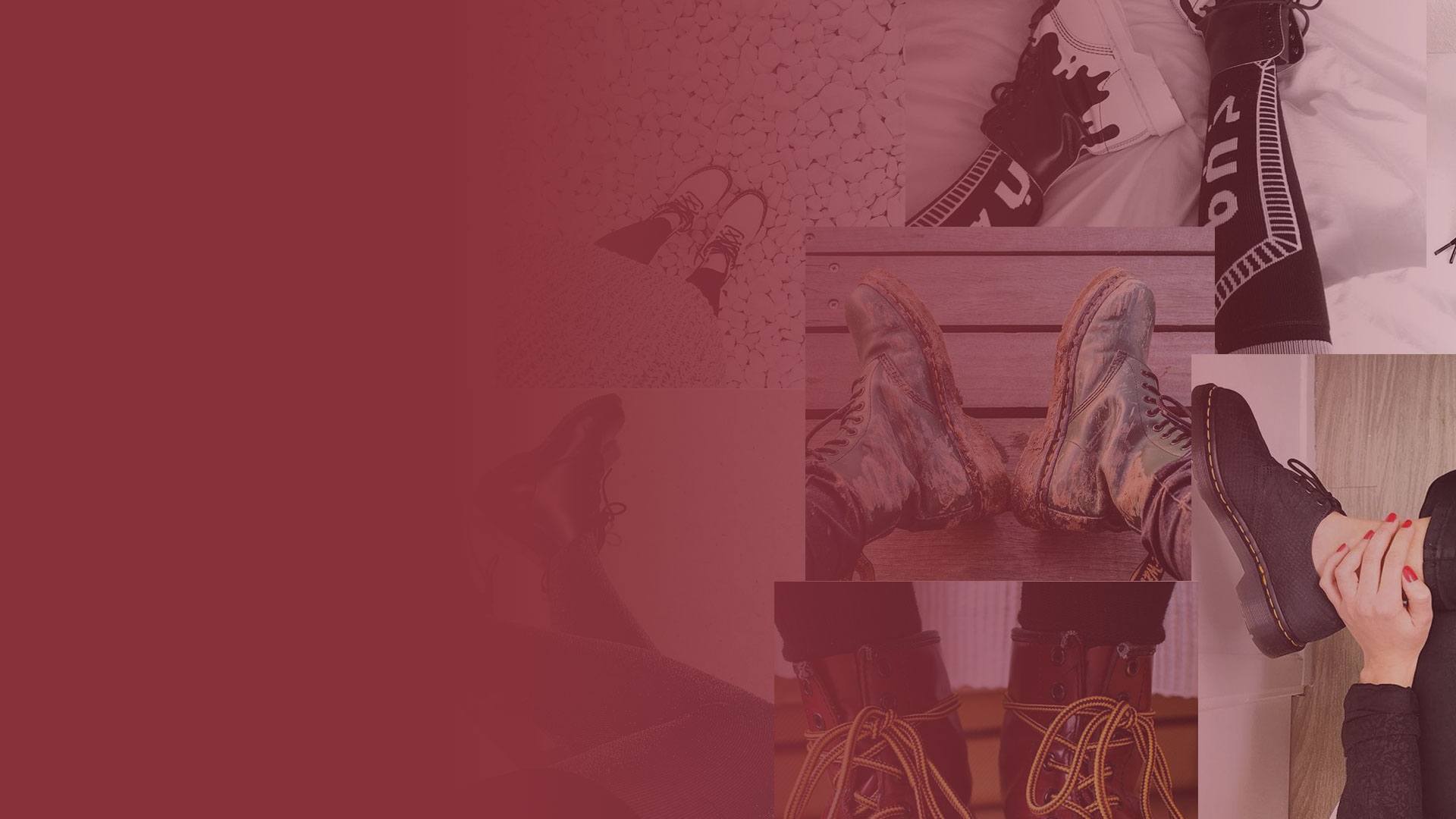
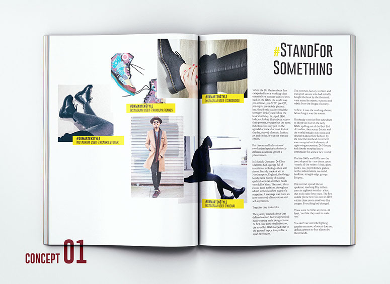
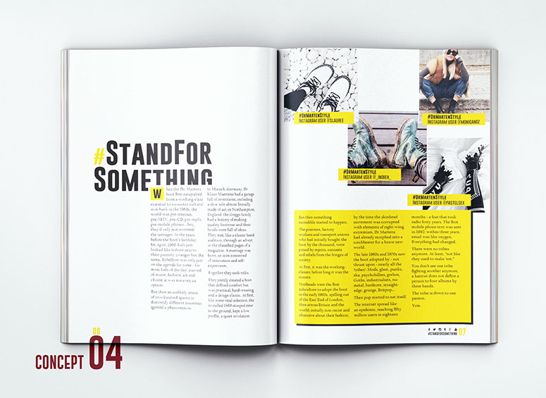
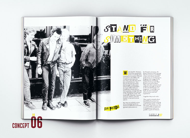
I came up with the idea of featuring Instagram pictures within the DPS as a why to show styles people go for when wearing the shoes. Browsing Dr Martens official IG account, I noticed a trend of "Docs of the Day" posts as well as these hash-tags, #StandForSomething and #DrMartenStyle
I collected images that I thought were really good and can be used in my DPS, then started to sketch ideas using my Pinterest research.
Brand History
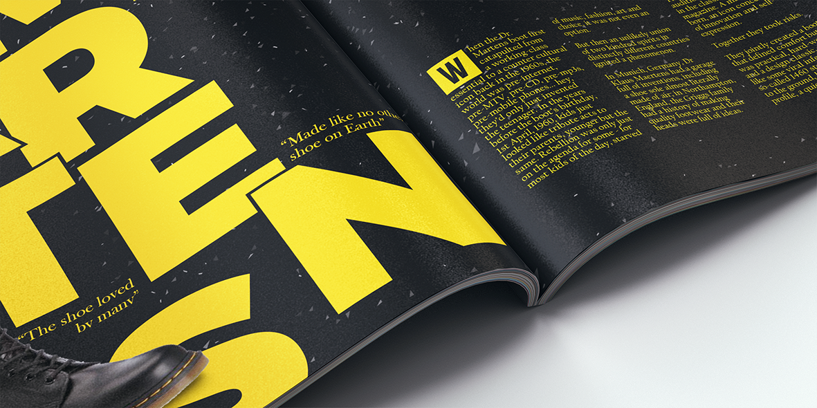
1945 was the year that revolutionised the shoe industry as DR Klaus Maertens developed an air cushioned soul that helped the recovery of his broken foot from the war.
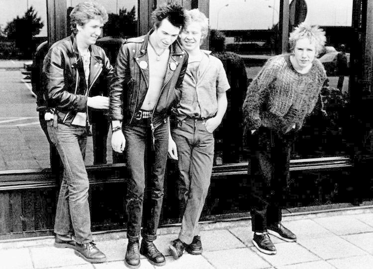
During my research, I found out Dr Martens popularity were mainly kicked off by punks and music group 'Sex Pistols', as well as their extremely traditional style and build quality, The culture that Sex Pistols brought to the table was completely different to what people were used to and of course, they wore Dr Martens labelling them as a fashion model.


CONCEPTS
Typography
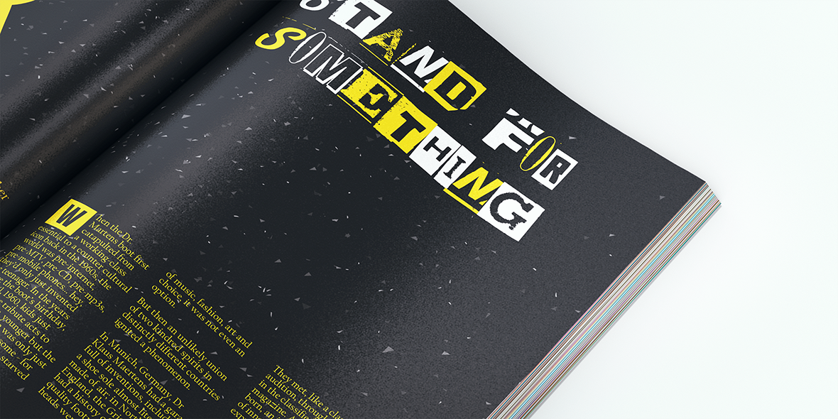
Sex Pistols album art
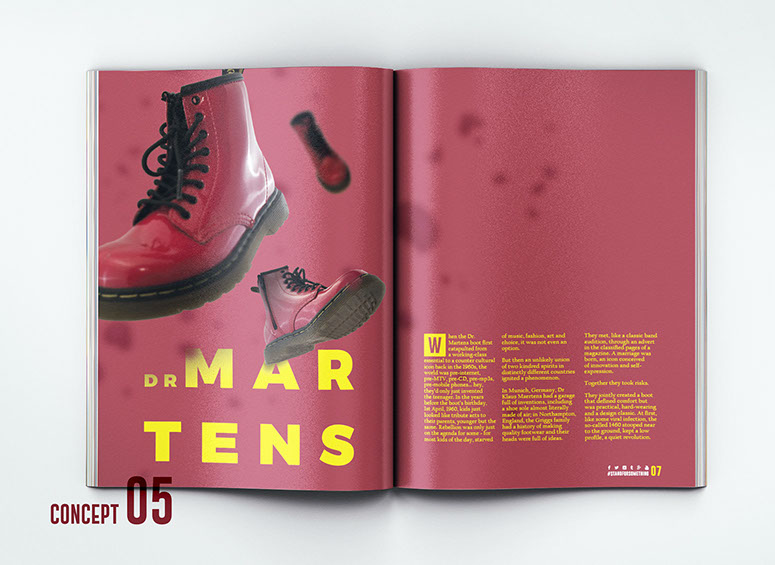
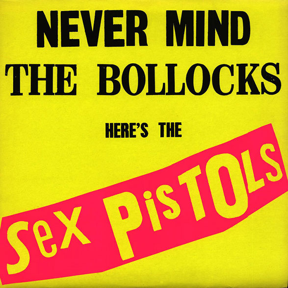
As I researched a little about the Sex Pistols and the album art they produced, I felt the need to go on their colours of 100% yellow and a bright pink from their album, 'Never Mind the Bollocks (1977)'. This album was very simple, and included photocopied newspaper clippings to make the wording. I found this very clever and creative because to me, that method of typography gives so much more meaning.
I didn't exactly replicate the colours Sex Pistols used, but I did use colours similar.
I used a 100% yellow for web and a slightly more orangy yellow for print to keep the bright appearance. For the secondary colour,, I used a purple/pink cross over colour as seen in concept 5 above.
RESEARCH
COLOURS
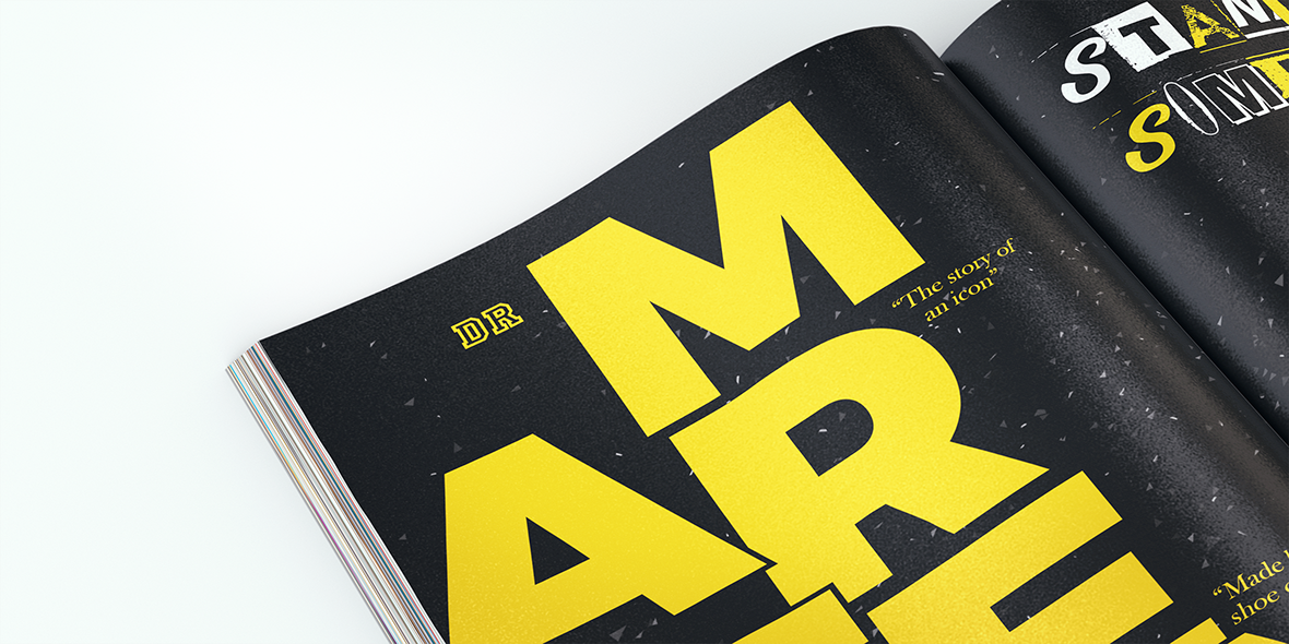
Font choices
Throughout my initial ideas, I was looking on various font sites like fonts.com and dafont.com to find a Serif for body text and a Sans-Serif font to to be used for the titles. The Sans-Serif font family I went with is called 'GoBold' (1 of the fonts is used for the titles on this page). The font family comes with a range of fantastic fonts and weights that look perfect for large title text and smaller sub-title texts. For the body text, I used a font called 'Californian FB' which only comes with 3 weights and is great for body text.
On Concept 6 & 7, I used a font called 'Anonymous Clippings' which is in the style of newspaper/magazine clippings, giving that authentic look similar to Sex Pistols album, 'Never Mind the Bollocks'
Title Font:
GOBOLD


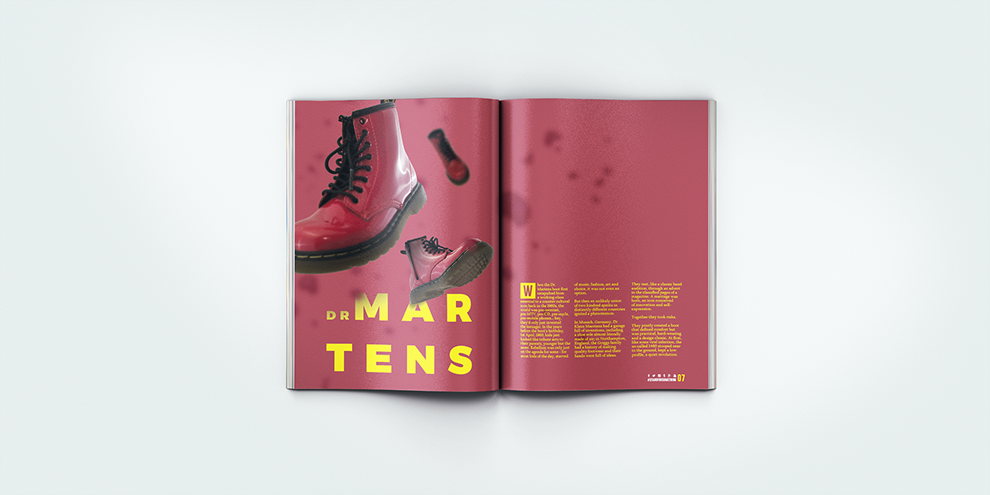
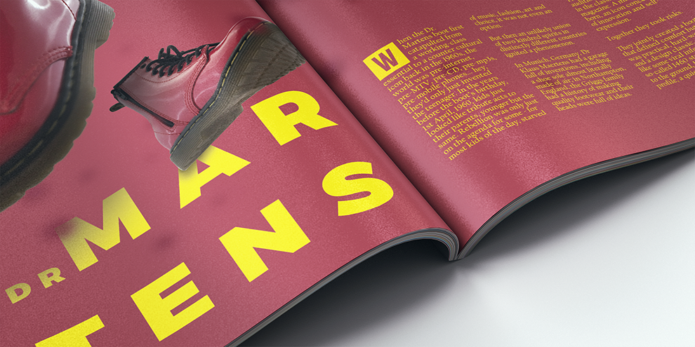
Gravity Shoes
During my research process, I found a mockup pack from Mockupzone called "Zero Gravity 2" which consists off devices, print and objects shot in different direction to make up a scene that has zero gravity. I liked this concept so I tried to replicate a similar concept with DrMartens shoes.
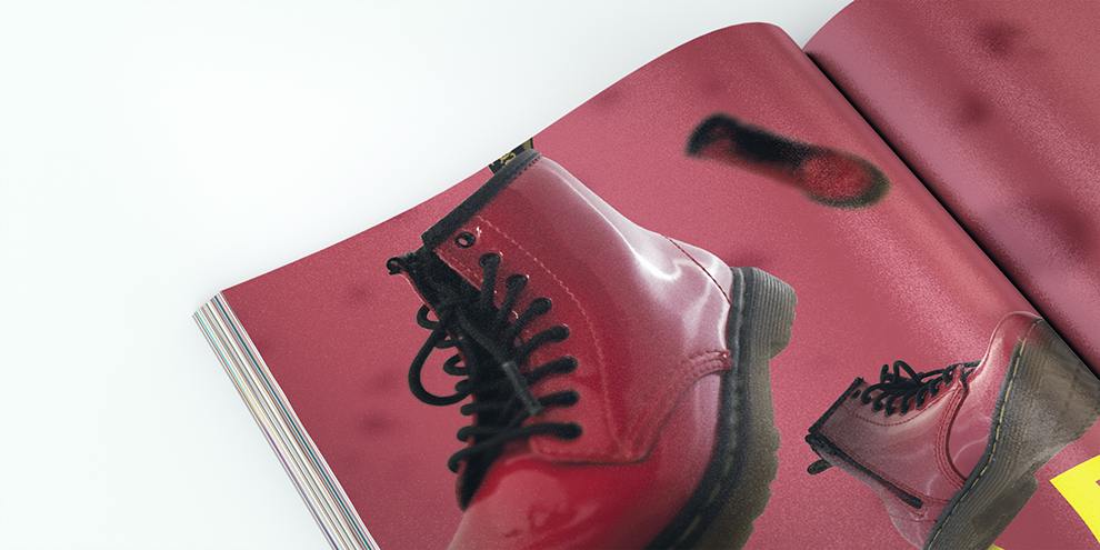
Nick, a colleague and friend, had his little kids DrMartens so I went to the photo studio and took as many pictures as I could from different angles. I then put the images into Photoshop and masked the shoe out, removing the string and adding shadow over the top of the text and blurring the distant shoe and the large shoe in front of the focal point to give a better immersion. This piece is great for a concept but I personally don't think it could work in print.
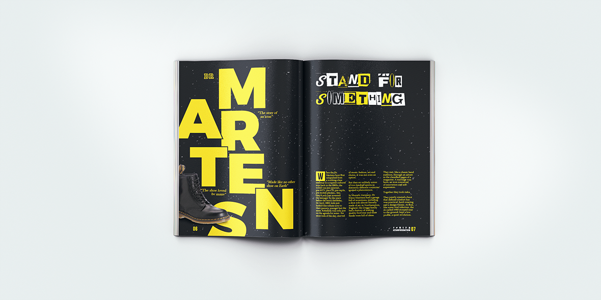
CONCEPT 5


Concept 7
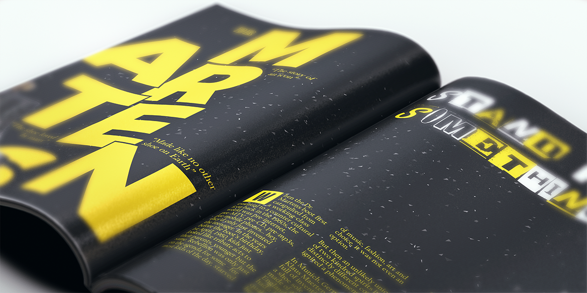
I really like this design as it is a lot different to the rest and works, however, the onl thing I could really do to improve it would be the add an image somewhere to represent DrMartens.
So for my final DPS, I added a black DrMarten boot in the bottom left over the top of my design to give a floating feel to the page. I quite like how it sits and how this DPS looks. I was originally inspired from a page on Pinterest as you will be able to see on my board above.
FINAL DPS

Thank you for viewing!
Bookmark this page if you're a VOCA VOCA student doing this project, you can use this for help/inspiration. If you prefer to view the PDFs and JPEG previews, please download them below (reference only).
DOWNLOAD THE PACK
Size: 804.8MB [Added 31/01/2016]

ENTERTAINMENT
DESIGN
THEATRE
FOLIO
CONTACT ME
ICONS SOURCED FROM FLATICON,
© CORRESPONDING AUTHORS.
VAULTNETWORK IS A PART OF VAULT
ALL RIGHTS RESERVED.