Brief
I approached Alex Sears, who is an artist/graphic artist and a friend of mine if she would be interested in allowing me to design a personal brand for her. My intentions were to create an identity that she could use to sell herself and promote what she does. The brand has to reflect her and her personal interests, so colours, fonts, look, feel etc. should all be to her liking so when people look at it, they will be able to see her personality.
I have set myself the task to develop a brand identity along with an A6 postcard she can hand and place inside artwork packages she may sell in the future, acting as a recommendation card. Along the design journey, I'll come up with other ideas (A2 poster, T-Shirt etc.) and propose them to the client as get her thoughts on them. I have been told by Alex that she is open to any ideas I may come up with, even if those ideas will be considered in the future. The brief for this project changed slightly throughout the early initial concept stage as Alex wanted to go with the name "Planet Sears" instead of her own name, which is a name I suggested to her months before this project so the light of day.
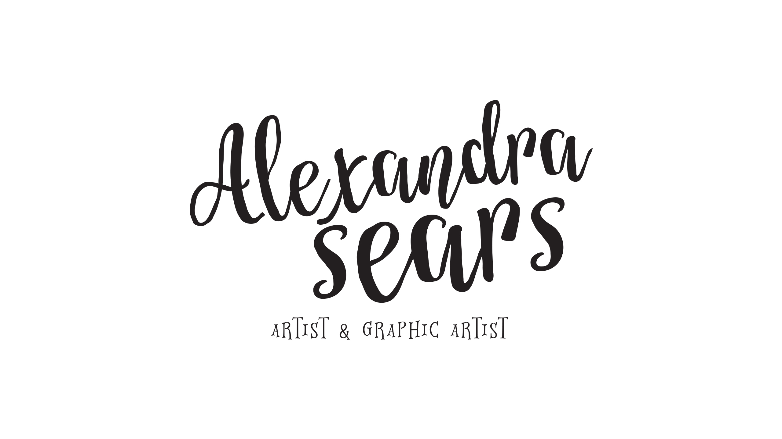
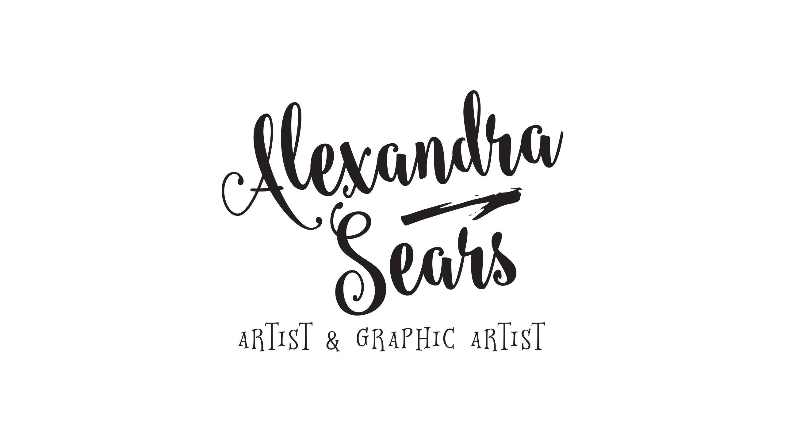
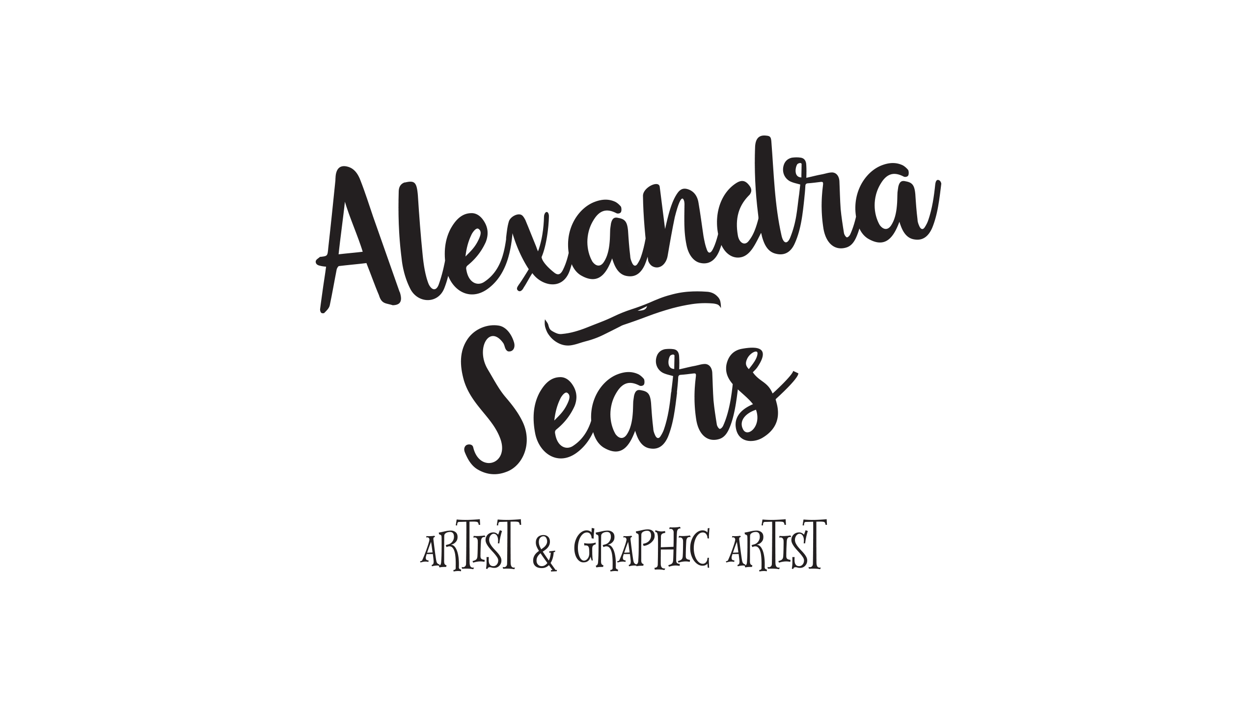
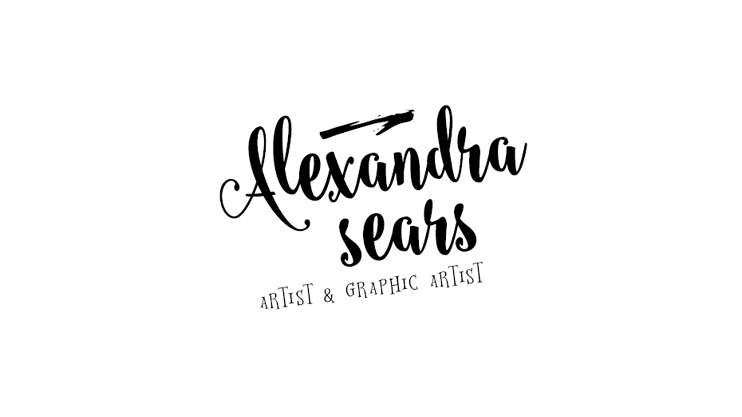
Name: Alexandra Sears
Interests: Art, art movements, drawing, sketching, doodling, books, vinyl, movies, film, Halsey (singer), Harry Potter [See below for more].
Colours: Midnight blue, purple/blue, yellows, gold, white, black.
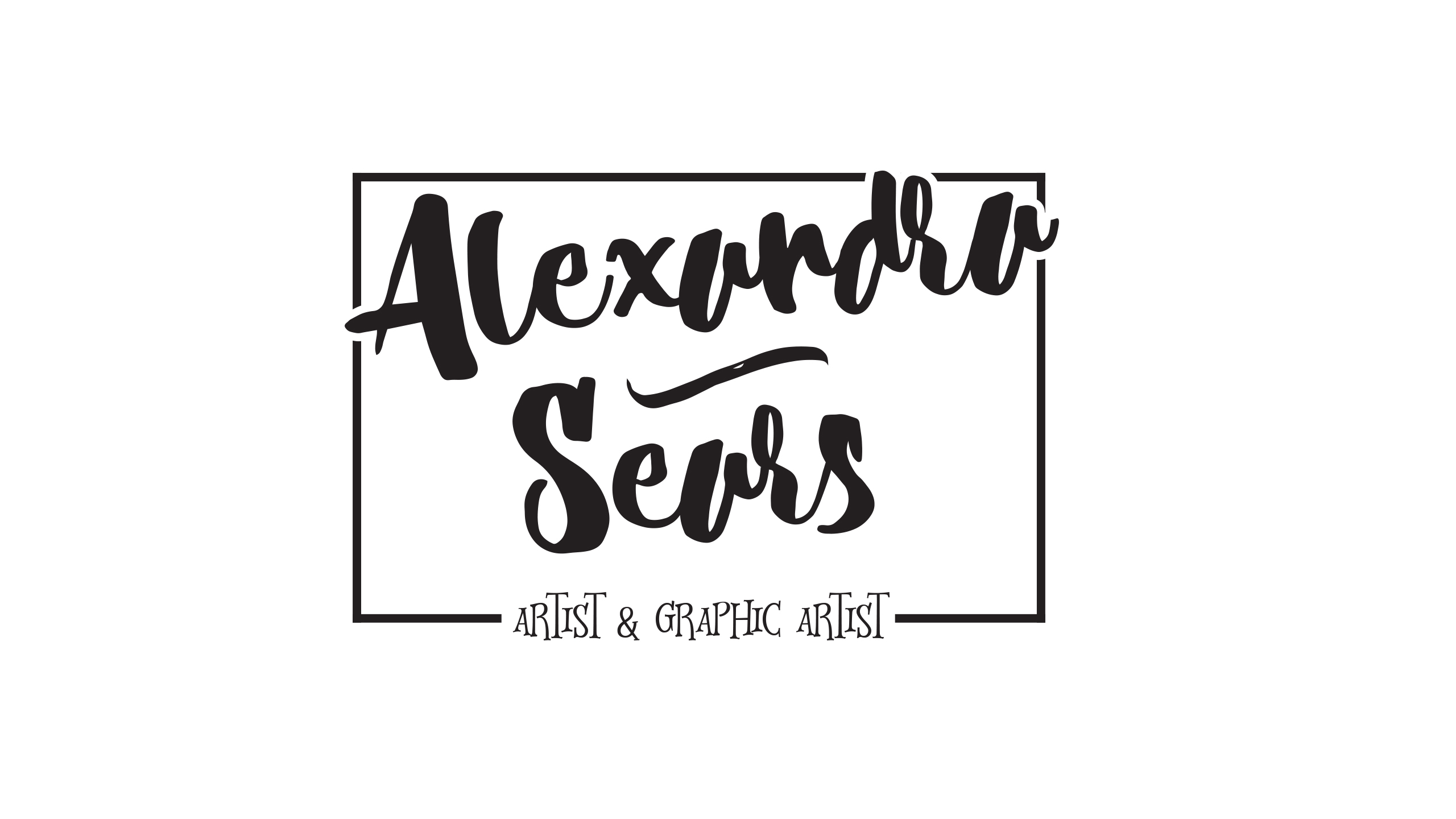
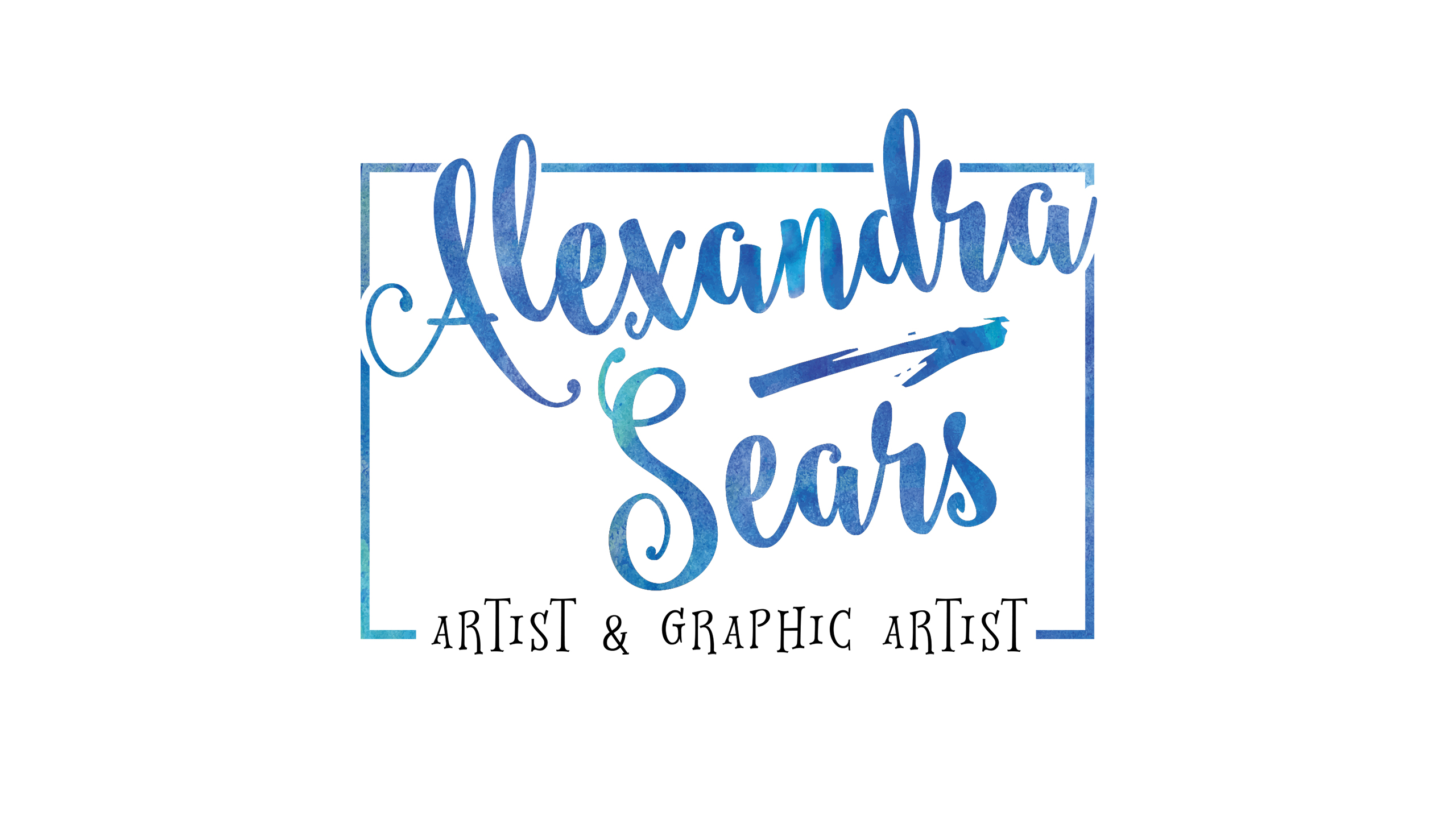
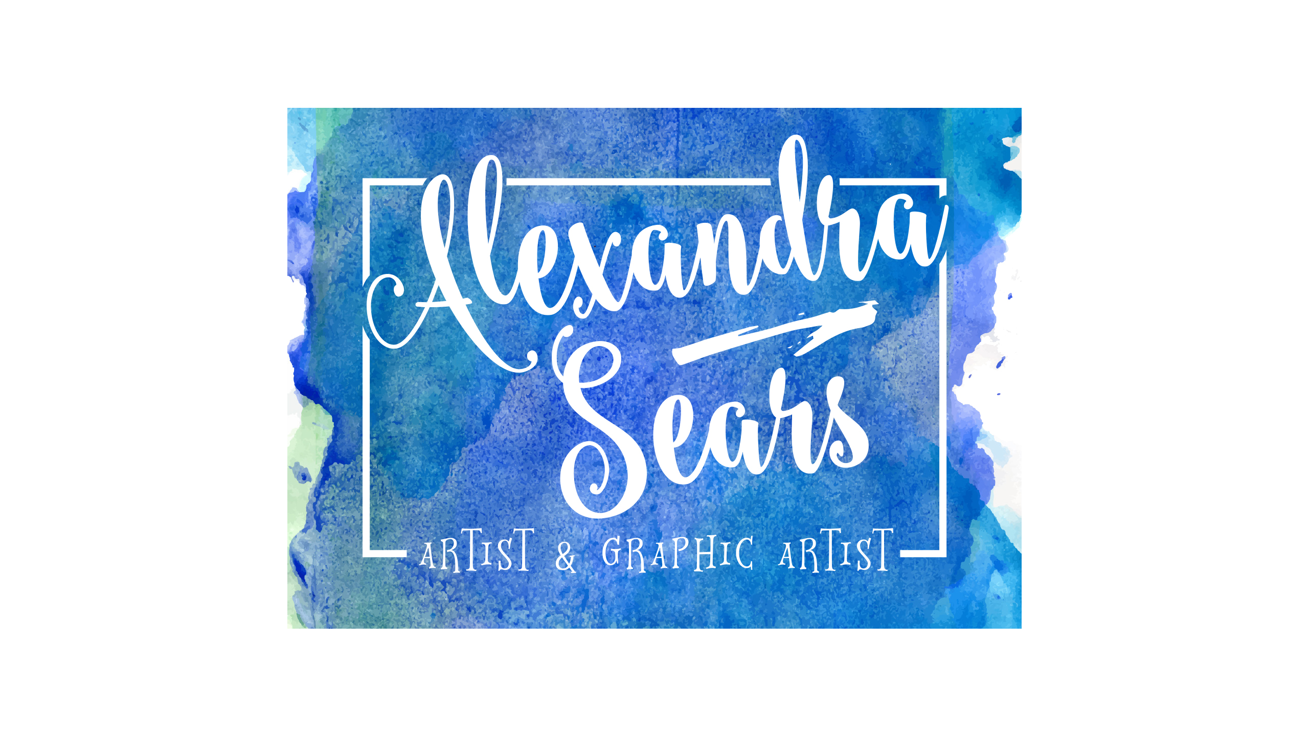
Preferred fonts: Any that's funky, really likes the font used in early typography experiments as seen in the above logo.
VIEW THE PDF
Client communication
Initially, I approached my client via email but after the initial email, I decided to meet up with her and discuss project ideas and what exactly she wants. Throughout the meeting, I put forward my ideas about a poster and T-Shirts and she seemed to be quite interested in that idea but after the original proposed personal brand identity has been developed and she's happy with it. Communication is key with any project, especially one like this, as ideas and the design process should be discussed at different stages. I feel a personal brand should be communicated across to the client more frequently than a company brand as a personal brand has to reflect the clients personality as perfectly as possible. Proofs were later confirmed via email for evidence purposes.
During the initial meeting, I asked my client to create a Pinterest board to use for inspiration and to get an insight to her likes. After looking at the Pinterest board, I created my own Pinterest board full of brand ideas and inspiration to help me, as well as looking at hand written font packs to experiment with. I drew some sketches really quickly in my sketchbook, just so I had an idea of her interests and some rough layout ideas for an A6 postcard. After I researched typography and sketched ideas, I experimented with the font pack I bought to see how it would look with watercolour and how the type would look in general.


Initial sketches
These are my initial sketches made to get a rough idea of what to design using the above research for inspiration.
The other sketches seen were for another project, not to be confused with this one.
Typography Experiments
Before my client changed the brief slightly to "Planet Sears", I did a load of typography experiments with my first sketches so she knew what fonts to choose, what works and what doesn't, giving her a bit more insight to the design development and allowing her to make changes really early.

Planet Sears postcard development
So I woke up one Sunday morning, feeling fresh and ready to go put had received a text message from my client saying she wants to go with "Planet Sears" as a name for her personal brand. Straight away, my designer genes sparked into action and I sketched the ideas really fast below and showed them to her. As you can see from the feedback screenshot, she really loved the idea of a planet with books, art etc. flying around, reflecting everything she likes.
Initial postcard designs
After receiving this feedback, I jumped onto Pinterest and searched for vintage poster designs and one really stood out to me. The design had a really nice vintage midnight blue colour and yellow for the text and moon, I thought I'd use this as inspiration to create my initial cover for the postcard and was able to create something really incredible! I made print tests along the way so I could see how the typography looked when printed and make any changes where needed.
Front of postcard w/ items
My client really loves this design and she chose it as her brand identity. The reason behind all the objects is I wanted to have elements within her brand that reflects everything she does and likes without making the design feel over crowded. I was able to give all the elements that low gravity effect giving the impression that the elements have "exploded" from the planet.
Alex loves the fonts I have choose, especially the main 2 on the front, as they reflect her "quirkiness" as she put it. Also the styling gives a very friendly, Harry Potter like feel and she loves that.
After showing this to my client, the design went into development stage where I tweak things to make the design more refined and better.
Back of postcard
Development
Kicking things off, I did some print tests of the postcard so I could see how things would look before sending them to print. I do this and almost every print project I work on simply because it gives you a better understanding of the design before you send them to print. Also, a print test will increase your attention to detail as you'll be able to see missed bits or design errors more clearly on a print out. I recommend everyone use print testing as a development method to test your designs print worthiness.
Looking at the print tests, I noticed the font weights were way too light and small to be read. And the cover (seen on the left), I noticed it looked at bit too crowded. To over come these issues, I removed the clock and pencil elements from the top of the cover and enlarged the logo more.
As for the typography on the back, I enlarged the body text to the same font size and adjusted the weight for easier reading.
Before (left), After (right).
Front of postcard development
Back of postcard development
Showcase
After showing my client the developments, I created a Twitter banner and a web image for her to use which she requested. On top of this, I came up with the idea of an A2 poster and a T-Shirt design at the beginning of this project and decided to design and showcase all the work to her. I mocked up the artwork to show how the design would look within and environment and give Alex a perspective on the design.
The main focus of this project was to create a personal brand for Alex that could be expanded on in the future as well as last a very long time, not a personal identity that would last a few months before becoming tired. I achieved this and created an informational postcard as part of the original brief and I'm extremely happy with the results, as she is too. In the future, I feel Alex would like me to design a lot more stuff when she has setup her personal workspace for people to view online. I could've concepted a website design, a mobile phone case, mugs etc. but I didn't feel this would be necessary this early on her journey, maybe something as a future project. I'm happy I've created a long lasting, good looking and expandable brand : )
A6 informational postcard
T-Shirt Design concept
T-Shirt Design concept
Web image
Twitter Banner
I did create some Instagram templates which aren't finished yet simply because she isn't ready for them and may scrap the idea of using them. However, I've included them in the package below so you can have a look when you download the package .
Thank you for viewing!
Bookmark this page for inspiration, I appreciate it! This project was done as part of VOCA VOCA NVQ brief for a real client. If you prefer to view the project files, please download the resource pack below (reference only).
"
"
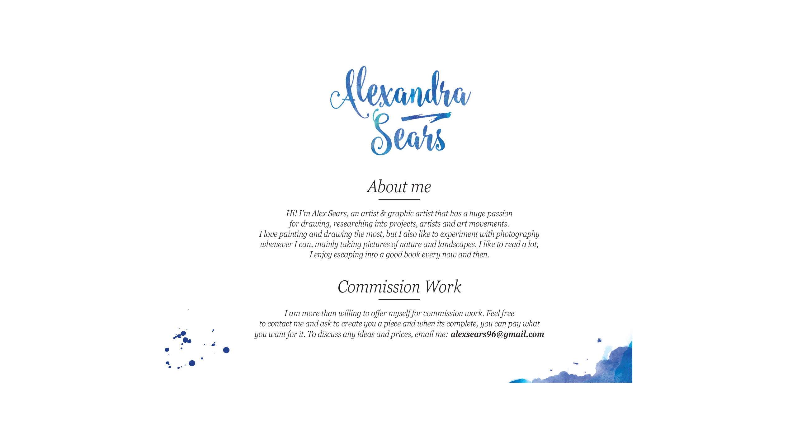
I really love how much the design reflects my personality, it's so me! I see myself next to the quirky font, swirling around my own planet consumed by music, art and book. I love it! I can see it on everything that I do and see it working with new stuff I get into. Absolutely amazing work Matt! I will be sure to come to you for future work and anything else I need for my identity.
Alex Sears, Artist & Graphic Artist
DOWNLOAD THE PACK
Size: 133.8MB [Added 01/05/2016]
ENTERTAINMENT
DESIGN
THEATRE
FOLIO
CONTACT ME
ICONS SOURCED FROM FLATICON,
© CORRESPONDING AUTHORS.
VAULTNETWORK IS A PART OF VAULT
ALL RIGHTS RESERVED.